Rorschach Or Bust
A small office gets a big makeover
What to say about this gorgeous office?! It all started when a local psychiatrist and friend, Dr. Brady Bradshaw, MD reached out to me about her new office space. She was half joking, half seriously concerned because her marketing flyer/website featured a beautiful, curated space, and her current office style was less than desirable. It was painted in a pallet that was not her taste and the furniture did not reflect her brand. My client wanted something chic, peaceful, and inviting to make her patients feel comfortable and considered. This was it before…


The design concept evolved from this beautiful set of Italian leather gray sofa and deep blue sapphire chair. They were found by my client at Bloomingdales during the holidays at an incredible price point that we just couldn’t pass up!


Beyond that, I had to be VERY intentional about the other furniture choices because of the design challenges in this space. Space, being one of the major challenges! My client’s list of must have’s were a largish 6’ couch, separate guest chair, desk, desk chair, side tables, and a good amount of storage to keep items she often uses with clients. Because we had already chosen this lush/good sized sofa and guest chair, it was important to choose smaller scale furniture for the other pieces so the office didn’t feel crowded once all the pieces were installed.

We found this great writers desk from RH Teen and I absolutely fell in love with it! Because many of the other details were cooler colors and materials (like the grays, blues, and chrome), I wanted to bring in some wood to warm the space up. The chrome drawer pulls tied into the room nicely and the great price point were a no brainer!
Another way I wanted to warm up the room was by adding in brass! My client was a little unsure of mixing metals at first, but quickly agreed that she liked the combination. Mixing metals is one of my FAVORITE ways to enrich a space and help it look a little less “decorated”. Intentional, yes, but overly “decorated” spaces are not my fortè… I added this incredible 47” round brass frame from West Elm. I seriously LOVE this mirror so much. It may or may not also be hanging in my dining room :-).

I ended up adding quite a few brass touches around the room to warm it up and incorporate the larger brass elements.
One of my other favorite brass elements was this brass RH side table with a gorgeous leather round center. I have these in my house as well and absolutely love them! They’re versatile, narrow, chic and can kind of be pulled around wherever you need them.


This great corner lamp was another great holiday sale find from West Elm and turned out to be such a great vertical in this corner…
Speaking of this corner- it was TRICKY. Like tricky tricky… Typically, I like to make whatever wall you “walk into” the focal point in the room. Think of walking into a bedroom- ideally you want to walk into the base of the bed, maybe a wallpaper behind it, and then layer all the goodness from that point on. Well, the “walk into” wall in this office had an eye level door for a utility closet… to make matters worse, it was brown. Trying to camouflage it as best I could became an immediate part of the painting plan. We painted it and the frame the same color as the walls, and popped this great tall lamp infront of it and bam! Best case scenario. Haha. Spaces can be tricky when you don’t care to invest in doing major construction, but there’s a lot you can do to accomplish your end goal- ie, hiding a utility closet.

Ok, it's time to talk about one of my FAVORITE parts of this office. Maybe it's because it was back ordered? (playing hard to get) Or maybe its just because its FABULOUS, but this bookshelf is my piece de resistance! From the very beginning I fell in LOVE. I used another CB2 wall hung shelf unit in an office last year, and became a big fan!
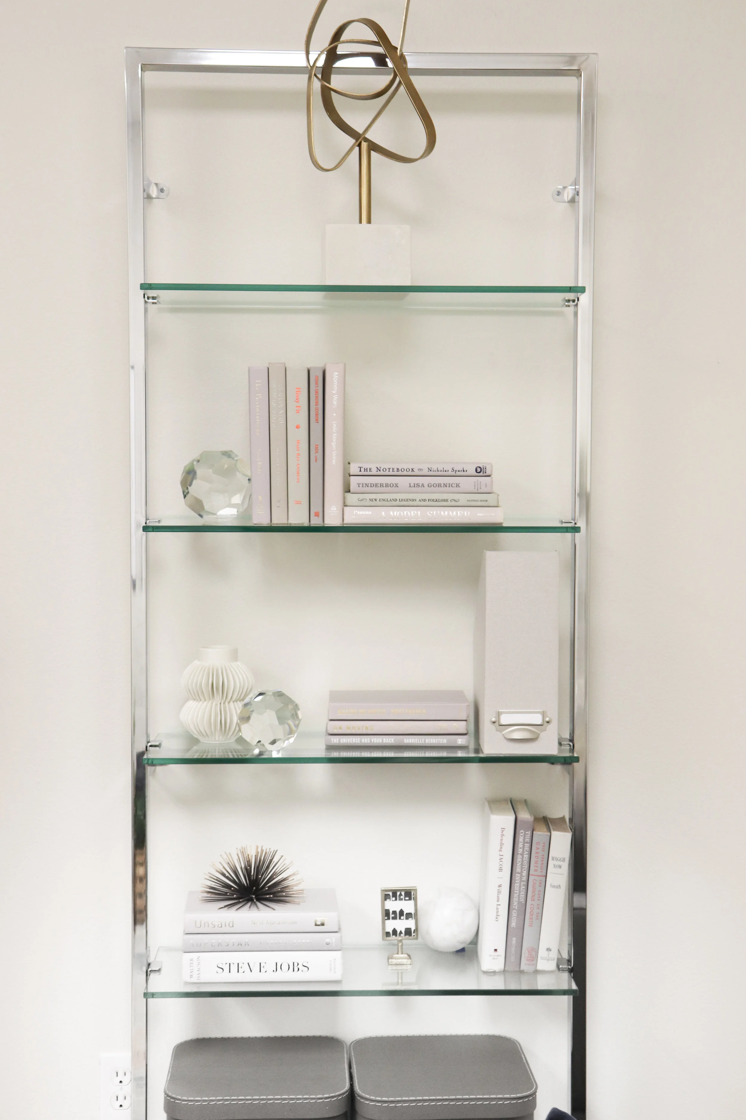
I sourced accessories from CB2, West Elm, storage boxes from Container Store, and found these incredible books from Booth and Williams. I HAVE to take a minute to tell you bout this rad company. Maybe it’s just me that thinks this is revolutionary, but I think it’s cool, so i’m going to tell you. They sell books so that they’re curated or coordinated for whatever you need. I needed 2 feet of gray books, so thats what I got! I could have chosen any color tone, theme, or length of books that I needed. I’ve seen designers use them to do rainbow bookshelves that are incredible too! I definitely see one in my future. Seriously check them out! (Not an ad, I just really like them!)


Ok, so the last couple pieces I want to tell you about are the ones that, I believe, really gave this space life. To be 100% transparent, I’m NOT a big color lover: but these kinds of color splashes set my designers heart on fire. I first sourced this great rug from West Elm and fell in LOVE. My client wasn’t 100% sold on the price, but we eventually both agreed that big impact pieces like this are worth the investment, even if it means sacrificing in other areas.


The other big colorful impact piece was this beautiful art piece by Minted. I have used Minted for years and years to order holiday cards, stationary, and party invites, and when they launched their fine art prints, their chic consistency continued. They offer a wide variety of size and framing options to make it easy to find a scale that worked. I again wanted to use brass on the frame to add some more warmth and was thrilled with the outcome.

Speaking of art- I have to touch on this gorgeous series of 3. These beautiful Rorschach prints (ink blot) were sourced by my client and are so cool! As a psychiatrist, they are such a cool nod to her work and something personal to make the space feel like her own. I found these amazing large scale frames from West Elm, and had custom matting cut to help these prints shine.

Overall, I am thrilled with how this space turned out, and mostly just feel honored to be asked to do it. Time and time again I am shocked and humbled to be invited into a space and feel so vulnerable when delivering the final product. Different spaces challenge, scare, and push me out of my comfort zone, and I have never been happier in my professional life. Cheers to the first space of 2019 and continuing the fun for many years to come.
XOXO
-MG
PS- If anyone is in need of psychiatric assistance, you can contact Dr. Brady Bradshaw, MD here.


“If you want to go quickly, go alone. If you want to go far, go together.”
A collaborative nursery for my little French girl
Here’s to celebrating the end of 2018 and ushering in 2019! For some of us we will gladly be saying “so long” to 365 days of uphill… For others, we’ve been nostalgically filing through photos from the past year, wondering how 2019 could be any better? I land somewhere in the middle; however, planning for this blog post has definitely landed closer on the side of sappy nostalgia.
In launching my business this year, I have been graciously given the opportunity to transform a number of residential and commercial spaces, but just recently have been designing lots of rooms for little people. Whether it be toddlers, or new borns, lots of littles have gotten fun new places to rest their precious heads. This made me think- how could I have not yet shared one of my FAVORITE rooms in my home!? Colette’s nursery.
If you saw my teaser on Instagram, I’m sure you saw that this room was a collaboration with a dear designer friend, Dallia Designs. We started working on this room in early 2016 after I moved into my house. I was due with Colette in late August and I wanted to have the nursery ready to go as early as July for the baby shower.
When her and I first met about this project, I brought this AMAZING Hyggie and West wallpaper. I saw it on Pinterest and immediately fell in love! This beautiful print comes in a variety of colors and I could honestly design a space around any of them! Seriously, go check them out. My overall “vibe goals” for the room were to keep things peaceful, feminine, but not too traditional. I wanted it to feel dreamy, but not cheesy, and I wanted the colors to feel relaxing- something to help the baby fall sleep. Room color is SUPER important when it comes to getting good rest, more on this another time… I wanted something that felt nice for ME to sit in all day (after all, its me sitting there hour after hour nursing my baby…) After 2 plus years of spending time in this room, I can tell you its STILL a serine haven.

I knew I only wanted to do wallpaper on one wall because
1- its an interesting design concept
2- its less chaotic/peaceful, and
3- because its a really big cost savings!
This wall paper is really reasonably priced, but installation can get costly… So one wall was the thing! I wanted white walls to keep things serene. But thought it was so fun to do colored trim and doors. I’ve LOVED this decision time and time again. More often then not, when I get outside of my comfort zone, I’m happily surprised. After this we started layering by necessity… Starting with the crib.

I REALLY wanted this amazing Vetro crib, but $5,000 definitely wasn’t in my budget… I TRIED to convince myself that it was (for a good month), but alas my practical side won out. FORTUNATELY, this beautiful crib from Land Of Nod (now known as Crate and Barrel Kids) came out around the same time! I realize that these lucite cribs are more common these days, but at the time this was the only non-$5k option. It felt like an interior decorating miracle- like God was blessing me by being financially responsible… Haha thats a thing right!?


Since the wallpaper was so beautiful, I really wanted to keep everything in and around the crib very simple (which was super hard to do because crib bedding comes in the CUTEST patterns- maybe next baby room!?). I had these pillows custom made by a local seamstress and added these great poms to give it some life. In hindsight- I wish I would have added something to the mint one as well- or maybe done it in a larger size? It kid of gets lost/ boring behind this beautiful velvet blush one. Add a sweet babydoll and viola!
Crib- check!
The next necessity for me was to find a great glider. Before I had Colette, I wasn’t even sure what this was- but my mom and sister SWORE this was necessary, and they were of course right. This was a little tricky because so many gliders are bulky ugly things… I had this one custom covered by Room and Board. It came earlier than expected, white glove delivery, and was BEAUTIFUL. I was so happy with how it turned out and have since ordered from their company again- their quality and customer service is outstanding!

**If you notice- I have the same pops from there pillow on the edge of the curtains! Such a fun way to tie them together!
This rug was another Pinterest find! I loved it in another nursery I found and used some detective skills to find its origin. Its made by Caitlin Wilson and have had SOOOO many people ask me about it since! Share the love! Her rugs are absolutely gorgeous! Photo is linked.


This beautiful unicorn head is by Fionna Walker England. I had the HARDEST time deciding which one to use!! She has tons of different animal head options and they’re all so cute! Believe it or not, she has even more to choose from now. I’m doing a nursery for another little girl right now, and I’m AGAIN having a hard time choosing… I digress.
This fun pom garland was an outdoor market find in Mexico! But there are TONS of great options out there, like one of my favorites, Pearl and Jane! I started with one their adorable carrot garlands for easter a couple years ago, and now I think I own one for each holiday and season!
The dresser is one of my top 3 pieces in this room! Not only does it have tons of storage space inside and on the top, the design is just GORG! It's a west Elm piece that I had custom painted the same color as the trim. I spray painted the hardware a brassy gold color and boom- here you go! I had always intended to change the hardware to ACTUAL brass hardware, but life happens. So here we are 2.5 years later.


These styled shelves were mostly from my friend who helped me with this room! I normally don’t use these particular Ikea shelves, but she had the idea to use the long and the short next to each other, and I think it turned out so cute! These gorgeous gold frames are West Elm and accessories are a hodgepodge from all over, I will link them.

Last but definitely not least, this vertical row of photos. This is obviously added later (shortly after her 1st birthday), and I LOVE this sweet detail. Growing up my mom always had “progress” photos of me and my two siblings and I loved seeing each of us as we grew. Colette is no exception, almost nightly she points at these photos and tells me all about baby Colette with her “horse baby”, and Colette with her flower crown. I had these done by Framebridge and I’m SO happy I did! The quality is outstanding and their hardware system made it easy to be sure they were hung properly.

This room is such a joy and truly sets the standard for all of the spaces that I design; not esthetically, but in my desire that ALL my clients loves their space as much as I love this one. Here’s to another year creating beautiful spaces and loving each other well.
XOXO,
MG

How to customize your home…
…without doing construction
I was absolutely honored to help one of my oldest friends customize their new home. The project was a little intimidating for two reasons- 1) this is one of my oldest and dearest friends, so I wanted everything to be PERFECT for her and 2) She and her husband are one of the rad-est couples I know. Not only do they both have incredible minimalist style, but they founded and run their own concept restaurant that is changing the food industry and improving the paletts of all those whom come in contact with their food. Needless to say- they're pretty much as cool as it gets.
As small business owners, they weren't ready to make a purchase, so instead opted for this cute, minimalist transitional home in the heart of Winter Park, Florida.
From our first meeting, we all agreed that the gray interior walls needed to go. They were making this cozy space feel unnecessarily small. Also, the way the previous owners had used the space was definitely different to say the least… The previous setup had us walking directly into the small makeshift living room- and I mean directly. Like, you couldn't open the front door without hitting a couch or coffee table (not being dramatic).
The next big room behind it was being used as an oversized dining room with a chandelier hanging at eye shot, right in the middle of the room. All of this was made worse by the fact that everything was painted a gray color- which by itself wasn’t bad, but the low ceilings and tight-ish space of this bungalow needed some room to breath. Because of all this- one of our first decisions was to paint everything white! We used Ben Moore’s Super White and it turned out GORGEOUS! I don't think the photos even do it justice! This color transformation was groundbreaking in of itself.
We DID however want to keep/ add in some character, since white walls can sometimes come across as sterile, which is why we decided to add this molding to the back wall. It was simple and clean, but just what the space needed to draw your eyes in after you enter the front door.

I know what your thinking,
I thought you said no construction!? I promise we didn’t! We had the help of a great carpenter that custom cut these 1x4 wood planks, pre-painted them, and used a nail gun to affix them directly into the wall. It was SUPER simple. AND, when my clients move out, they can easily be pulled off the walls, and the holes fixed with putty, the same way you would fill in holes from hanging a picture frame. I know right?! Who knew. We STILL want to add a cool peel and stick removable wallpaper above the molding, but it wasn't at the top of the priorities list. And who doesn't have something more they want to do to their house!? Whats life without having something to look forward to :-)
This back wall molding was exactly what was needed to redefine an otherwise confusing space… The backroom with the molding then officially the showstopper and hub of all things family, the living room. So, what happened to the previous living room you might ask? Well since its not exactly ideal to walk strait into someone’s couch, we made this into an oversized mudroom/ foyer. We added great wall hooks, bench seating, wall shelves, decor, and a great rug. There’s NOTHING like adding a great rug, especially in this minimalist home. And how amazing is this bright red? We snagged this beauty from Urban Outfitters during their black Friday sale.


This beautiful bench was snagged from World Market during their 40% off sale! can we say BEST DEAL EVER!? The darker shelves are also from World Market, and the lighter ones are repurposed from their previous home.


The next space that we decided to tackle was their kitchen off of their new living room. Fortunately, this hip modern family didn’t care much about their formal dining room turned living room, all they requested was a chic bistro table for family meals at home. We found this beautiful table on sale at West Elm and these great bamboo chairs at World Market again, during their big 40% sale. They were the perfect addition and size to meet the need.
Although, I absolutely loved our choices for furniture, the kitchen needed SOMETHING to give it some life. It was tricky because we couldn't paint the cabinets, or change countertops or floors, so we wanted to do something super dramatic to the walls- aka my best friend black paint. specifically, I used Benjamin Moore’s “soot” and absolutely LOVED the outcome. Painting small spaces dark colors Is one of my FAVORITE ways to give some life and drama. We did the same to the bathroom and both spaces have a special energy all of their own.
One of the other ways that we made impact without making an structural changes was with lighting! These great investment pieces can make your house look like a million bucks! The best part? Take them with you when you leave! Just make sure to keep the old light fixtures to put back, and these light fixtures can transition with you wherever you go.

I absolutely LOVED the midcentury vibe of their milky globe living room pendant from West Elm, the simple gold lined flush mount lamp of their new foyer, and this rad back midcentury piece for the bathroom. The bathroom light is actually a sconce super on sale from Bellacor that we turned sideways! Don't get pigeonholed into using products the way its recommended, there’s tons of different ways to get creative in your space, and save money! #winwin
The other priorities you might ask? The #1 priority was their SWEET little boy’s room! Moving from crib/baby life, to toddler-hood was a big and exciting transition, that these mindful parents wanted to make a lot of fun for their little man. In keeping with the concept for the house, we knew we wanted to keep the room esthetically fresh and clean, while adding in lots of fun pops.


This sweet bed is from Ikea and was the foundation we built on. From our first meeting, he walked me back to his room and wanted to show off his cool new “big boy bed”, which was followed by jumping up and down on it. It was clear that LOTS of play would be happening in this room. To be mindful of the budget, I tried to incorporate a lot of items that they already owned, like these great Ikea Kallax cube shelves, but added these cool bases to dress them up! The walls also needed a little something extra, so I used blue painters tape and an Exacto knife to tape off and create these sweet mountains. I loved the idea of him waking up to see these great big adventurous mountains every morning, even if we do live in Florida…


They already owned these picture ledges, but they were a little short for a good book ledge, so i bumped two up to each other for the top shelf and two for the bottom shelf to make them appear longer. After all- why buy new when we can repurpose!?

I hit up Target for this cute wolf head, and World Market for his high wood shelf. I swear every mom needs a high “kids can't reach it” shelf in their child’s room for all of the memento/ breakables to be displayed.


Since we couldn't change the floors throughout the house, rugs became a big part of this transformation. Not only are they functional, warm, and inviting, but covering a floor that wasn't exactly their vibe was a win/win. And, they’re another item that can go with them when they leave. I added this great world map rug from H&M Home (for just $60 btw!), and of course we had to have a track rug for his cars… We still want to add a big room size rug under these smaller rugs for style and safety purposes, but it wasn't a current priority.

The cute toddler sized nightstand is a step-stool made by Melissa and Doug. Not only is it super cute and the proper scale for his toddler bed, but can continue to be used as a step stool after he grows out of this bed. Everything else in the room was toys and books restyled. And that little piano!? Can we just take a minuet to acknowledge it? SO cute I can't even…


This family is so lovely that they could truly make any house feel like a home, but a little extra staying to help you feel settled never hurt anyone. I am absolutely honored to have come alongside them during this journey and can’t wait to see all the memories made between these walls.
XOXO,
MG


Weekend Getaways
A condo renovation in New Smyrna Beach
This condo has been on Claudio and I’s heart for SO many years now. Since the time I can remember, I would go and visit my grandmother at her beach condo. I would spend all summer long with her and tons of weekends in between. When I think of New Smyrna, I think of warm days filled with Watermelon dripping down our faces and the dry salty feeling on your skin driving home. I can still hear the sound of my grandfather rummaging around in the freezer, finding a big box of Klondike ice-cream bars for the kids (himself included).
When we finally had the opportunity to buy a condo, we knew we wanted it to be a relaxing getaway; something easy, turnkey, that when we walked inside the stresses of daily life melted away. I immediately knew that I wanted to create a chic boho vibe with light colors- our little piece of serenity.
I still have not tackled the master and guest room in this project, but this will come at a later time…
This condo unit was originally built in the 1960s, so the original floor plan was definitely something to be tackled… Teeny tiny kitchen, carpet/ linoleum everywhere, and no modern appliances or lighting. Thank GOODNESS the amazing previous owner (a realtor friend), did a full renovation 15 years ago. Although they did a fantastic job, a lot of the finishes were consistent with styles seen 15 years ago, and we wanted to give the space our personal touch.
We wanted to do a light and airy update to an otherwise perfect floor plan.

To start, we immediately painted everything white. I recently took the same approach when giving a facelift to a good girlfriends Winter Park cottage. There’s just something about white walls and make everything feel bigger and can help everything breath. I used Ben Moore’s “Simply white” and we were VERY happy with the outcome. Its definitely white, but still feels warm. We then replaced/ changed all the things… we changed hardware everywhere, kitchen countertops, backsplash, put in a new washer dryer, all new flooring, new drapes and shutters, and transformed the second guest-room into one of my favorite parts of the project, Colette’s nursery.

Nurseries and children’s rooms HAVE to be one of my favorite parts of decorating someone’s home. There are so many fun little details and ways to make children feel like they have a little slice of something magic. This is exactly what I wanted to do for Colette. This room is super small compared to her nursery at home, so I knew I had to be very selective with which pieces I went into it. I love this cool little dresser that the previous owners had left behind, but it definitely needed a refresher. I ended up painting it the same color as the walls in a glossier sheen and found this great gold hardware from school house. I don’t know about you, but I think it looks pretty banging.

I found this great Camel print from, Etsy and absolutely fell in love with it! I had it printed and framed by one of my favorites, Framebridge. They did an absolutely amazing job. This cool rattan chair is from the Opal House collection at target and ended up being the perfect size down scale for the space. Did anyone see the episode of fixer-upper where Joanna Gaines does the little girls room and has a giant rainbow macramé piece on the wall? Well I absolutely fell in LOVE with that! Fortunately, I was able to get in touch with the person that made it, Barton Designs, and have a smaller version made for Colette’s room. The other piece I found from Etsy and was SO happy with the quality and beauty. The shelves were simple from IKEA and found fun books to complement the space. Books are always Colette’s favorite part of her room, so the shelves were a no-brainer. This great little lamp was found at target, and this cute little cactus is from Fiona Walker England. We have one of her animal heads in our nursery at home, and she absolutely loves it! Also this little car and camper is one of Colette’s favorite toys! I thought it was so cute that I had to include it in the room, but I love the functionality of her playing with it every time we come here.
In the living room, I got to repurpose a LOT of things from home. This great little credenza used it be found in our guestroom at home, but I knew the gray blue tone would be perfect in this space. And this “hook wall” is one of my favorites! Whenever we’re going to the beach, we are always grabbing a hat or a bag to throw some extra things into as we walk out the door, so I knew we wanted to do some fun hooks as a visual piece, but also for functionality.


We absolutely love a deep, comfortable couch and it seems to be the place that everybody in the family ends up congregating after a long day by the ocean. We originally had a beautiful white Restoration Hardware couch in here, we loved it, but it just wasn’t enough space for the whole family. I ended up switching it out for this gray West Elm sectional, and could not be happier with our choice! The quality was absolutely fantastic and the grey color is a little bit more forgiving with a littles around. Spatially, it definitely takes up more room, but did not make the room feel crowded as I thought it might. These drapes go back to my favorite trick of the trade, they are multiple IKEA panels sewn together with blackout fabric on the back side, and added pinch pleats. I absolutely love my local seamstress that has helped me elevate so many rooms. I am a firm believer the window treatments are the most Underutilized and impactful part of interior decorating. The circular coffee table is from Restoration Hardware, got it crazy on sale from the outlet! Nothing like good Restoration Hardware outlet find. They literally had like 10 of them… Anyone else looking?

Outdoors I was absolutely inspired/copied from one of my favorite designers/bloggers Chris loves Julia. PLEASE take a look at their page, they're fabulous. If you look at their outdoor set up, ours is basically a miniature version. These great outdoor couches and rugs were both from world market, and have been absolutely fantastic! The quality is so much better than I ever would’ve imagined. The central coffee table is from West Elm as well, it’s super heavy but fantastic for the beach because we tend to get strong winds. Whenever we leave town, we just bring our cushions inside the house and put them back out whenever we come back to the condo, it’s been super easy for us.


The long outdoor table Has been the hub of all things family gathering. We actually had Thanksgiving dinner here this year, and it was so magical under the moonlight with tall pillar candles running down the table, and all of us sitting around, telling each other what we’re thankful for. On any given weekend you can find the entire Gambin clan crowded around this table playing cards, doing a school project, telling stories, and/or having a Brazilian barbecue. This place is so close to my heart because of all of the special memories that I have made at this beach in years past, and I so look forward to all the special memories to make in the future. -MG

What went wrong!?
Quick tricks to save a little time and money…
As you may have seen via Instagram- I have recently launched my design company- Melissa Grace Designs. This is a MAJOR passion project that has been on my heart for quite a long time. As a third generation decorative enthusiast, this line of work is truly in my genes. I’m just ecstatic to finally be doing it in a formal capacity.
When you get a chance- please check out the “about” section on the site. This gives you a quick glimpse into why I do what I do- and how i want to do it. The quick and dirty is- most of us are super busy and don't have the time to make our homes/ spaces look the way we’d prefer for them to look. Also- getting help in this department seems daunting (and expensive)…
As for me- I’m a fixer. I have never met a problem I didn't like- so as I stepped out into the world of professional design and decorating, one of the first things I asked myself was “how do I do this better”? Lets use low cost ways to accomplish the same goals. Its not ALWAYS possible- but some things are easier than you might think… So here it is- some of the ways/ hacks that Ive tried to keep cost low in accomplishing the same goal.
Rugs- One of the most common decorating mistakes I've seen made in otherwise beautiful rooms is a poorly sized rug. Usually they’re too small. Who am i kidding- I've totally done this… Especially in the day and age that SO much is ordered online, its easy to underestimate the size that you really need. Don’t be afraid to go to a rug store and ask for help. Tell them what your looking for, bring inspiration photos, and TELL THEM YOUR BUDGET. There is NO shame in that game. If your working together to accomplish your goal- your more likely to get there. Think teammate, not competitors.
While we’re on the topic of rugs- how about a cow hide!? Yes please! These babies are no longer reserved for cowboys and those friends that go out hunting every other weekend. Especially layering two or three in a room can be a durable, pet friendly way to navigate a space- specially one with odd dimensions.
Curtains- If i was sitting in front of a good friend I would probably say something like “GIIRRRLLL IKEA curtains are the bomb.com”. Leaving them as they come- not always so great. One of my favorite tricks is to get a beautiful white (called white, but actually ivoryish) color curtain, take them to your favorite seamstress to have lined with white blackout material, and add pinch pleats. These few steps will immediately help your curtains go from looking like $39.99 to $3,999.
And if your going to the seamstress anyway- why not add tape!? Not the sticky kind- the fabric kind. Giving your curtain a fresh detail immediately gives a “custom” touch that no one else will have.
Hopefully these were helpful and easy ways to encourage your next right decorating steps.
Can’t wait to see whats next? Sign up for our email list to stay current on all things MGD. -MG

Workin’ It
a modern downtown office
Work work work work work.
For those of us that don't have the bank account of Rihanna… this is exactly what we will be doing for the foreseeable future. So why not create a beautiful place to do it in!? I was asked by my husband to transform his office into something super cool and professional that reflected his style. Sounds easy right?
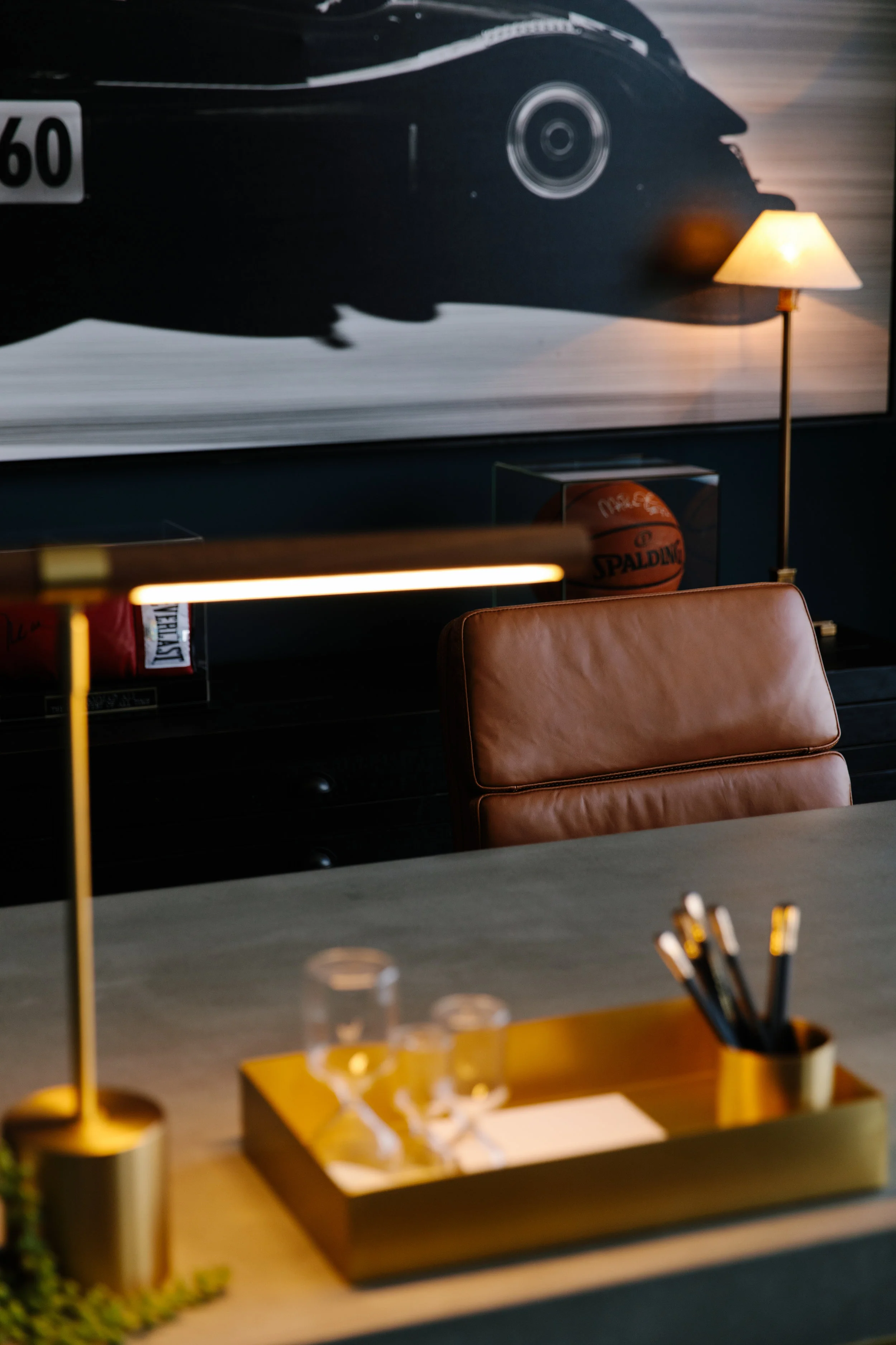
Mr. Gambin is definitely a man that knows what he wants, but spatially it was important to make priorities of all the things, and MANY things there were. He knew we wanted a sitting area that was both comfortable for team meetings, but could also host clients if they opted for a more casual environment, than the conference table (more on that later). He asked for a bar cart, snack area, awards/memorabilia area, family memories space, comfortable desk chair, all wires hidden from sight, conference room for 4 people, “do not disturb light”, two office entrance doors, great lighting, wall hung TV and the office necessities like printers, phone etc. I was able to achieve ALMOST everything without making the space look too crowded. Unfortunately, the double doors ended up not being possible in order to maximize the space. The office square footage was smaller than we had originally anticipated. Other than that- everything on the list made it!

This West Elm love seat worked out to be the PERFECT size and option for this space. These chairs were also sourced from West Elm and worked out super well to compliment the paint color.
**West Elm is one of my favorite retailers, specifically for smaller spaces. Their pieces tend to be high quality, great designs, and tend to not break the bank. If there is one recommendation to make- I would just be cautious on scale. If you have a larger space that your decorating, their line may not suit your needs.

Speaking of paint- I am OBSESSED with all of Farrow and Ball’s paint colors, but this one takes the cake in a whole new way. Its called Hague Blue- and i’m pretty sure i could use it in every project for the rest of time… Ok maybe not that far- but clearly its GORG.
The credenza & coffee table is old Restoration Hardware from our house in Baldwin Park. Its always great when old pieces can transition from one space to the next. Not having to buy new really helped my budget.

By far the show stopper of this office space is the custom made brass and concrete desk made by Price concrete here in Orlando. Working with their owner, Caleb was super easy and he really did a fantastic job. We have been able to work together on several projects and the outcomes just keep getting better! I think at one point someone said he was the “Clint to my Joanna”? Basically the best compliment Ive ever been given.

Lastly- the piece de resistance is this vintage car poster hanging on the back wall. My husband is VERY into cars. He drives them, rallys them, invests in them. One of his favorite weekend activity is to wash his car… You get it- he loves cars. So clearly this space needed a classy car situation. So here it is! This was a piece I had done at HG Arts here in Orlando (I believe they are now closed, please someone correct me if you know differently) a few years ago for his man room (currently our daughters play room), and it transitioned PERFECTLY into this space.

What would I have done differently? Unfortunately, per building regulations, we weren't able to change the ceiling tiles or remove the blinds- but otherwise, there isn't much I would change about this space! I’ll check this one off as a win and look forward to tackling the next.
Blessings! -MG